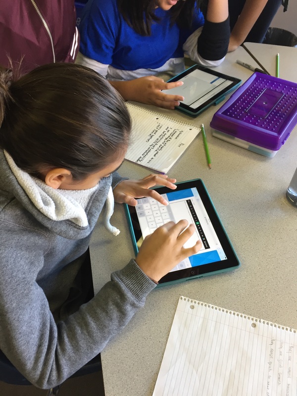
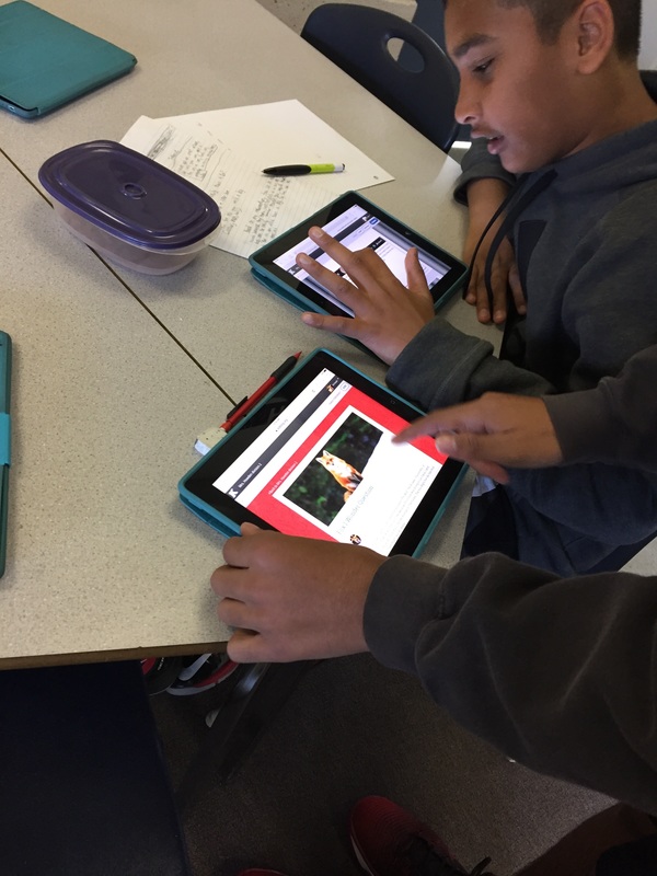
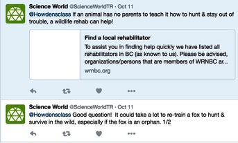
This week we started gathering information about foxes to build our background knowledge and better understand how Pax (also a fox and one of the characters in our novel) will adjust to living in the wild. We asked deep thinking questions and tried to find answers using reliable online resources (including tweeting Science World). After gathering information, we wrote blog posts to share the interesting information we discovered. Living in the wild is going to be challenging for Pax, so we hope that he will quickly adjust to finding his own food & shelter while avoiding predators. Either that or we hope he finds Peter!
 |  |
Two weeks ago we wore pedometers to track the number of steps we take in a school day. Although there were variables that affected our data, it nonetheless gave us information about our daily physical activity. This week we documented our data in a table of values and we’ve graphed that data using circle and line graphs. Many of us noticed trends in our data and we realized that different conclusions can be drawn when data is graphed differently. The line graph clearly showed that we became more physically active as the week went on. A great experience to reflect on while setting goals for physical health.
Two weeks ago we wore pedometers to track the number of steps we take in a school day. Although there were variables that affected our data, it nonetheless gave us information about our daily physical activity. This week we documented our data in a table of values and we’ve graphed that data using circle and line graphs. Many of us noticed trends in our data and we realized that different conclusions can be drawn when data is graphed differently. The line graph clearly showed that we became more physically active as the week went on. A great experience to reflect on while setting goals for physical health.
Learning Intention: I can connect mathematical concepts to personal fitness data
CRITERIA:
CRITERIA:
- Demonstrate how to create a table of values to display fitness data
- Accurately graph data using a circle graph and a line graph
- Calculate the distance walked
- Identify patterns and trends to draw conclusions
- Reflect on how the experience has impacted you
After a class discussion about BC’s natural environment (and how indigenous people and settlers were drawn to the area by easy access to salmon, cedar trees, rivers, oceans, etc.), we started exploring how ancient and modern civilizations are also impacted by the environment. Right now we are building research skills by using a variety of secondary sources and taking notes. Although the internet contains a wealth of information we need to remember to consult reliable sources and to summarize in our own words.
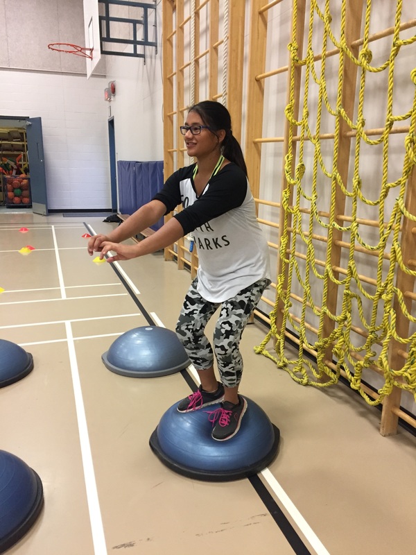
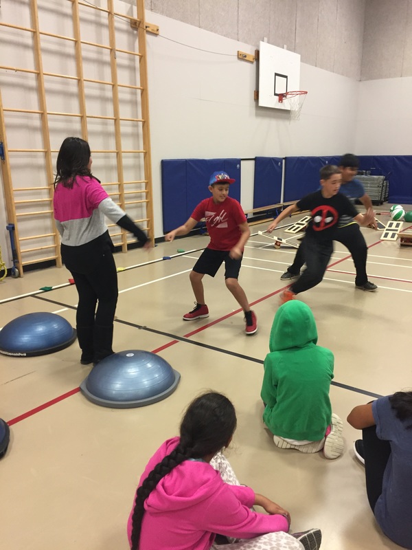
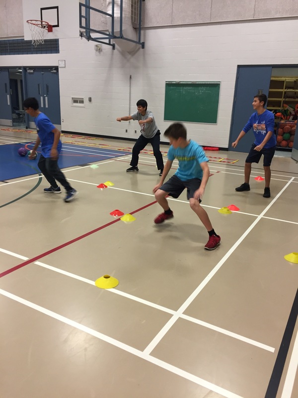
We also spent time reviewing the Fit Kids stations. We'll be leading the stations in a few weeks so it was helpful to do a run through.
We also spent time reviewing the Fit Kids stations. We'll be leading the stations in a few weeks so it was helpful to do a run through.
 |  |  |
 RSS Feed
